At Pecode, we’re always interested in smart projects that challenge us and motivate us to push our limits. We’re excited to work on innovative products that deliver meaningful value and can change the world for the better.
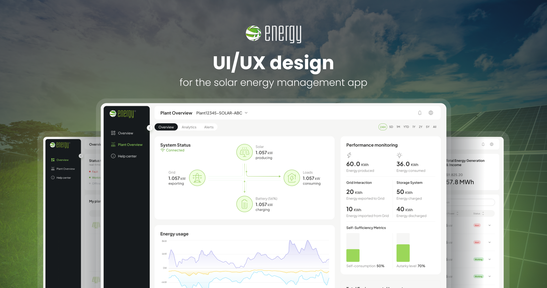
In this case study, we outline the result of our cooperation with a leading provider of solar energy systems on their solar app.
Brief summary
- We were requested to create a UI/UX design for the solar app from scratch.
- Our team covered the full cycle of design creation – from initial research to delivery of the final solution.
- We successfully completed the confirmed scope of work and implemented an intuitive UI design that aligns with the client’s requirements and fulfills user demands.
About the project
This project involved developing a comprehensive solar energy management application for a client specializing in renewable energy solutions. Our client is a leading provider of solar energy systems, aiming to enhance their customer experience by offering a robust platform for monitoring and managing solar energy usage. The goal was to create a user-friendly app that allows users to:
- Monitor real-time performance data of their solar panels.
- Track daily, weekly, monthly, and annual energy production and consumption.
- Analyze energy usage to optimize consumption.
- Set alerts for maintenance and performance issues.
- Provide insights on energy savings and environmental benefits.
The client’s request
The client hired our team to create an expert UI/UX design for a web application in the solar plants monitoring field. The application has different roles due to multiple view modes. As the most important, the “Customer” view required special attention and had to be very catchy, modern, and elegant, with graphic animations, showing data coming from various sensors. The Vue.js, Javascript, and CSS skills were necessary to facilitate the integration of graphics into the web app.
The challenge that we faced
The biggest challenge was to design an interface that could display complex, real-time data in an intuitive and user-friendly manner. Solar energy data can be overwhelming, and it was crucial to present this information in a way that was easily understandable for users regardless of their technical backgrounds.
To address this issue, we conducted extensive user research in order to grasp the needs and preferences of the target users correctly. Based on the gained insights, our team
- Developed a mood board to establish the visual and emotional tone of the platform, ensuring a cohesive and engaging user experience.
- Created wireframes to visualize different layout options.
- Implemented a clean, minimalistic design to reduce cognitive load and make the app more approachable.
- Used data visualization techniques to simplify complex information.
Solutions we provided
We added the following features:
- Real-time performance monitoring. We designed a dashboard displaying real-time data such as current power generation, total energy produced, and system status. By utilizing graphs and charts, we visualized data in an easily digestible format.
- Historical data analysis. We developed screens to view historical data over different time periods (daily, weekly, monthly, and annually) and provided interactive charts that allow users to explore and understand their energy consumption patterns.
- Alerts and notifications. We designed a notification system to alert users about maintenance schedules, performance issues, and other critical updates. By using icons and color codes for quick recognition, we ensured that alerts were prominent and easy to understand.
- Energy savings and environmental impact. We added new features to calculate and display energy savings, cost savings, and the environmental impact (e.g., CO2 emissions prevented). Besides, we provided users with tips and recommendations for optimizing their energy usage, displayed in an engaging and informative manner.
Area of responsibility:
- User Research:
- Conducted user research to gather insights into user needs, behavior, and preferences.
- Analyzed data to identify key pain points and areas for improvement.
- Wireframing:
- Created wireframes to outline the basic structure and layout of the app.
- UI Design:
- Designed high-fidelity mockups with a focus on a clean and modern aesthetic.
- Ensured the design was consistent with the client’s brand guidelines and visually appealing.
Tech Stack
- Figma for wireframing, prototyping, and UI design.
- Adobe Illustrator and Photoshop for creating and editing visual assets.
Result
Our team completed the defined scope of work and delivered a functional and easy-to-use design for the solar energy management app.
Key outcomes:
- The implementation of an intuitive interface and real-time data features resulted in a significant user satisfaction increase.
- Better energy use for users was achieved through detailed analytics and suggestions.
- Client engagement was improved as users could easily monitor and manage their solar energy systems.
The Client’s feedback
The client provided very positive feedback about our cooperation. They appreciated the seamless integration with their existing systems and the comprehensive data insights. They specifically mentioned the higher user engagement and the proactive maintenance alerts as significant benefits.
The client also expressed interest in future enhancements, such as adding an admin panel.
